People often seem surprise when I told them I start doing watercolor for about 2 years. I then quickly explain what I did before I start doing watercolor. They understand a bit more, but still seems to be surprised. On the other hand, I've seen some paintings done by artists who been painting for many more years but finding things fundamentally wrong with them.
Read MorePainting speed is not a skill, it's aquired by experience
Quite similar to the loose style that I got quite a few emails about, painting fast is not a style nor a skill. We live in such a hurry today, and quite often we want things fast: Email over a hand written letter, people read the headline and come to conclusion instead of study deeper, we stream videos online instead of physically go to a Blockbuster and pick up a movie. Granted, many of these changes are for the better, we are able free up more time for things are more important. But many people in this generation started to weight speed more than quality.
Read MoreBehind the painting - Beuna Vista Street

Welcome to another Behind the Painting! Where I share my process and thought behind one of my recent paintings - Beuna Vista Street. This painting is based off a photo I took during my vacation in California in the past December. I took my family to Disneyland California Adventure. While I brought my camera just to take photos of my family. I came across this specific scenery which I thought has the potential for a good painting. So I quickly took a photo of it.

Subject Matter
When I was there, the background tower caught my eyes. I love the Spanish looking architecture! It provides great shape with wonderful lighting on it. On top of that, the lamp post, the palm trees and the cables all provide great visual interest and shape languages. Now that I think of it, this is a bit of cheating because it is clear to me that Disney put much thought into designing the theme park, so finding visual appealing scenery is quite easy! But as always, it is not good to copy the photo one to one. Some adjustment has to be made in order to create a better composition and design. So here are the things I've changed:
My interpertation
- Crop (blue) - I was using 28mm focal length when I took this shot. Human eyes focal length are closer to 50mm. Which means 28mm gives me more view than a typical human eye. It will also cause some distortion of the image. So what I do in the first is to crop my reference image. I intentionally cut off part of the palm trees to make it looks taller.
- Scaled up the tower (green) - Since the Spanish tower in the background is my favorite element in the scene, I want to emphasize on it just a bit more. It will still be in the background. But making it taller creates a more dramatic scale and visual interest, as well as better composition.

- Taking out the visual competition (yellow) - The lamp posts on the right is another great visual interest, but the palm trees on the right are overpowering them. So I pushed them back a lot more and make them a lot shorter. That makes the lamp posts stands out more and frames the scenery more.
- Change the figures (red) - Figures are necessary in this scene because I hardly see Disneyland without visitors. However, some of the people in the photo are quite close to the camera, that makes them looks really big. It breaks the scale that I want to achieve, so I change the figures quite a bit to a couple taking a kid facing the viewer. If you look carefully, you'll also see the kid is wearing a Mickey Mouse hat ;)
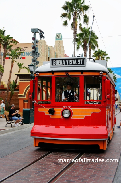
- Adding more stuff - I added a cable tram in my painting. Even though it's not in the original photo, I know there is a red cable tramp that goes back and forth in the theme park. I believe paint that tram in will add the authenticity and will make the painting more interesting, so I google a reference photo from the web. Since I am not copy this photo exactly, it is not an issue.
And here's the finish painting again:
Now the picture looks more balanced, hopefully more interesting and exciting! Again a successful painting takes quite a bit of thinking and planning, one of the biggest mistake is to blatantly copy the photo reference. You are not a camera, you have time and freedom to change things around to make it your own picture!
Top 60 Watercolor Blog

Yesterday I was informed by Feedspot that I am one of the top 60 watercolor blog! It was an honor and a pleasant surprise, because I've only been blogging for about an year. I really want to thank you for your support and subscribe. And I also really appreciate anyone who shared my blog to others. If you find the content here helpful, please share my page to others! I know this is just the beginning, and I will be continue to write and paint.
The power of white spaces

I once shared a portrait painting on the web. There were quite a few feed backs. One of the feed backs jumped out to me. The person said I shouldn't leave the background so plain, it will be nice if I paint the portrait in an environment. While I appreciate the person's feed back. I have to disagree that we have to fill the page with as much visual information as possible.
Like a brief pause or silence in a piece of music. White space is essential to bring out the contrast and to help the viewer focus on the subject. Experienced artists understand how to use those effectively. This is especially important for watercolor. Since you can't paint white, you need to put in some thoughts and leave the white out. Unless you are using gouache, but it is not as clean and doesn't feels the same.
There are few reasons why you want to leave an area white or very light (one light wash):

- Bring out the dark/shadow next to it - When you leave white, it turns into light in your painting, when put light next to dark, it turns into form.
- Enhance the silhouette - There are places in your painting you want a strong shape and silhouette. Especially if the shape is dark, leaving it in white space can really makes it pop. Even if it's just a few little dots of bird in a white sky, it creates the sense of space in a 2d surface.
- To give your painting a soft light quality - You might've seen some photos with a subject sitting in front of very bright background. Such as a person sitting in front of a window. Because the camera expose to the subject, the background is blown out into a soft bright bloom. This is not always bad, it can gives a very soft look if this is what you're going for. Same thing for painting. While we don't have to mimic all the soft lighting quality, by leaving the subject in a light white space we can create the same effect.
Design a painting is as important as important as how you paint it.
Design a painting is as important as how you paint it. The more I paint the more time I spent thinking about the composition, value grouping and shape design. Some of the painting that I love have great design. Because that's the first thing you see, it makes your painting technique secondary. They are both important, but far too many people focus on painting skill and forget about the importance of painting design.