Water is essential to watercolor. You loosen and dilute the paint by adding water to it. It is also water that makes watercolor transparent. The right paint and water ratio is directly related to the value and the opacity. It can be a bit tricky to get it right at first, but it will eventually become part of your instinct with enough practice and some observation. Unfortunately I can not help you with the practice part, but I can provide you some tips to help you along the way. Obviously, the dryer the mixture, the more intense the color. But there are some other things that can give you an idea how wet is your mixture:
First check - palette
Before you put anything on the paper, you can observe your palette and get an idea of the intensity of your mixture.
The more water your mixture, the bigger the puddle is.
The more water you have, the bigger the puddle your mixture will make. That's because the water will gather on a non-absorbing surface such as your palette. Much like when the raindrops on your windshield. When it's raining very hard, you see bigger droplets as they slide into each other and form a bigger water puddle. The same thing happens when you mix your paint in your palette. If your mixture in the well of your palette has a big puddle of water, it probably means that your mixture has a lot of water.
When the mixture has less water, you will be left with some wet streaks instead of a puddle.
Now as you add more paint, it becomes harder for the water to gather into a puddle. So as your brush gliding across the palette. Instead of a puddle, you will be left with some water streaks. Because there's not enough water to form into a puddle.
Of course, the size of the puddle and wet streaks will also be determent by how big is your brush. A big mop will create a much bigger water puddle since it holds a lot more water. So adjust it accordingly.
Second check - paper
After you do your first check on your palette, take a deep breath and go for it on the paper! Paint a small area first as a test. A small brush stroke should be able to tell you if your mixture is just right, or is it too dry or too wet. And then you can react accordingly. If it's too dry, add some clean water on it to loosen up the paint. If it's too wet, grab a paper towel and get rid of the watery paint.
When the mixture is wet, it will look light and transparent. The brush can glide smoothly across the paper. The more water you have in your mixture, the more bead it's going to form (if you are painting tilted like me). These watery, light mixture is great for a clean big first wash, and for glazing.
Adding more paint into your mixture, the color will intensify, and the paint will be drier. The brush should still be able to move very easily on the paper. The bead will still form, but it will be smaller and darker. These medium mixtures makes the majority of the painting for me. They give enough punch and value while maintaining the translucent quality of the watercolor. This mixture will also reveal some paper texture. If you paint with a rough surface paper, you will be getting a little bit of dry brushing texture.
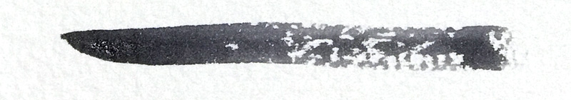
This intense mixture is by adding very little to no water. You might still need a tiny bit of water (maybe a drop or two) to just make the paint move-able. I often dip my brush into the water bucket, and dry it with my rag or paper towel. Using a damp brush and work directly into the paint well, or straight out of the tube. This mixture will be mostly opaque and strong. I often use these for detail work such as figures, cars, dark shadow on the building, and foreground elements. You can see in the picture that this dry mixture of paint leaves you quite a bit of dry brush mark. Which can be great if this is what you are looking for. Typically, you can't cover this type of dark mixture paint unless you use gouache. So when you are able to use a mixture this heavy, think twice before you put down your mark.
Again it takes practice and several paintings to get a good grasp on the right mixture. You can also dive deeper and experience with different brand and color of pigments, some are naturally more staining and granulating. Some colors are weaker and requires very little water to show (such as Cerulean Blue). Some colors are very intense (like Daniel Smith's Carmine) and you only need a tiny bit of paint and lots of water.
My advice is to use what I share today as a starting point and a guide line. But take time to play with and experience with your palette. And very important to train and trust your eyes.